An Extra Click?

I’ve seen some bad ideas in navigation, but this subtle one takes the cake (a nice German Chocolate cake).

Typically when you see navigation, you see a list of links. Click on the link, you go to the next page.

Wrong.

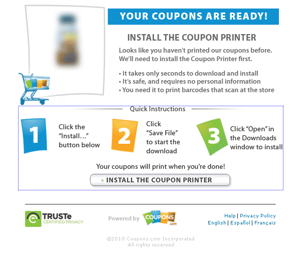
On this particular site (nameless), which was recently redesigned (and nicely by the way), someone came up with the idea of making the site visitor click a button after selecting a link to follow. Mind you, the tooltip tells them to click the button to continue.
Read More

When Bad User Experience is Embarrassing

Restroom signage

Where would you enter the restroom?


I admit it … I’m a user experience geek. And at times, I can drive my wife nuts.

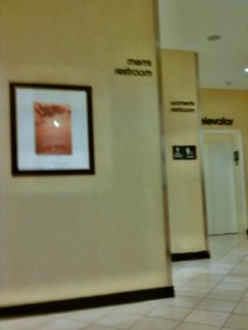
On a recent shopping mall outing, my wife and I paid a visit to an upscale department store, just to use the facilities (of course). While waiting for my wife, I observed a major user experience flaw. What made it so amazing is the this upscale retailer prides itself on its presentation. As men and women entered the restroom lounge area, over 70% of them appeared confused as to the location of “their” restroom. Several men were seen entering the women’s restroom in error. Not to be outdone, women were seen stepping into maintenance closets and service areas. Yet there were signs marking each restroom by gender. So why the confusion? Hadn’t the retailer done enough?

Read More

Time for Restaurants to Get Their Websites Right

I previously wrote about an experience where a restaurant forced me to visit their website for their menu, only to discover that their website (including their menu) were in Flash.

Recently, I again had the need to lookup a restaurants menu online, via a mobile device. This time, the menu was in PDF format, making me traverse virtual hoops to see what the restaurant offered. Why do restaurants make it so hard to obtain information?

Read More