
Note: The creation of this article on testing Use of Color was human-based, with the assistance on artificial intelligence.
Explanation of the success criteria
WCAG 1.4.1 Use of Color is a Level A conformance level Success Criterion. It requires that color alone must not be used to convey information. In other words, if you’re using color to indicate meaning, state, or action, like red text to indicate an error or green to show success, you must provide another visual cue as well.
Examples of Use of Color Failure
I have experience these issues, as recently as last week. After submitting a form, text inputs that have a validation error present a red border around the text input, with no other indication of the error, or any explanation of what the error is and how to resolve the error.
The red border is acceptable, however, as the error is indicated by the border color alone, an additional visual indication is required, such as text.
Another example is status “dots,” that indicate the status of a process. By using color alone, people with vision impairments like colorblindness or who are blind will not be able to receive the same information as a fully sighted individual.
| Status | Process |
|---|---|
| Back-up | |
| Re-sync | |
| Rebuild |
By adding text to the color dot, the information can be received by a greater, wider audience.
| Status | Process |
|---|---|
| Complete | Back-up |
| Failed | Re-sync |
| Complete | Rebuild |
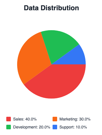
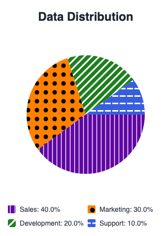
Another common example involves charts and graphs. When solid colors are used, people with color blindness may not be able to differentiate the differences presented by the chart.
By adding pattern fills to each slice of the pie, you provide additional visual information that can be used to identify the differences and not by color alone.
Who does this benefit?
- Users with partial sight often experience limited color vision.
- Some older users may not be able to see color well.
- Users who cannot distinguish between certain colors (often called “color blindness”) benefit when information conveyed by color is also presented in other visual ways.
- People using limited-color or monochrome displays may be unable to access color-dependent information.
- Users who have difficulty distinguishing between colors can rely on text or other non-color cues.
Testing via Automated testing
Automated tools can quickly scan large codebases to flag elements that use color styling, like red text or green backgrounds, helping developers spot potential color-only indicators across pages. Some tools even detect color use in form fields, charts, or buttons without labels or patterns, prompting further review.
But automation has limits. Tools can’t reliably tell if color conveys meaning or is just decorative. They may flag harmless uses (like a red banner with clear text) or miss real issues when color is used dynamically or without clear context. Evaluating whether non-color cues, like icons or text, are present often requires human judgment, especially for charts, forms, and status indicators.
Testing via Artificial Intelligence (AI)
AI-based tools can quickly scan large sites and flag patterns where color may be the only visual cue, like in charts, form errors, or links. Advanced models can identify common UI elements and spot repeated design issues, especially in templated content. Integrated into development workflows, they enable continuous monitoring of color-based accessibility risks.
However, AI can’t fully grasp why color is used. It may miss subtle violations or flag compliant elements, especially when alternative cues like icons or bold text are present. AI also struggles with custom components, subtle color differences, and interpreting visual design the way a user with low vision or color blindness would. While some tools simulate color vision deficiencies, AI relies on code, not human perception.
Testing via Manual testing
Manual testers excel at spotting when color is used to convey meaning, like red for errors or green for success, something automated tools often miss. They can assess whether visual cues like icons, text, shapes, or patterns effectively supplement color, especially in charts, forms, buttons, and alerts. Manual testing also catches color-dependent elements that appear only in certain viewports, themes, or interaction states. With tools like color-blind simulators, testers can better understand how users with limited color vision experience the interface.
However, manual testing can be time-consuming and inconsistent. It requires WCAG expertise and a trained eye, and results can vary without clear guidelines. It doesn’t scale well for large, dynamic sites, and testers may miss hidden or conditional color cues unless thoroughly explored.
Which approach is best?
No single approach for testing 1.4.1 Use of Color is perfect. However, using the strengths of each approach in combination can have a positive effect.
Automated tools quickly flag color usage in text, buttons, and forms, while AI can detect more complex patterns in charts or status indicators. But neither can fully judge whether color is conveying meaning or if sufficient non-color cues are present. That’s where manual testing comes in, human reviewers can confirm whether meaning is clearly conveyed without relying on color alone. This layered approach offers broader coverage and more accurate results.