At first glance, the page looked right.
A clean header with site navigation. A polished hero panel. A familiar grid of cards and tiles. Everything you would expect from a modern, production-ready website. I ran several browser-based automated accessibility tools, and the results reinforced that impression. Aside from a handful of color contrast warnings, the page passed.
Accessible, right?
Not even close.
The Moment Everything Broke
As always, I moved beyond automation and started testing with a keyboard. This is where accessibility either holds up, or falls apart.
Within seconds, the experience unraveled.
Focus moved from the main navigation… and then jumped. Not forward through the content as expected, but down the page to a set of interactive hotspots embedded within a map. Entire sections, including elements styled as buttons, were skipped completely.
This wasn’t a minor defect. It was a fundamental breakdown of interaction.
Time to inspect the code.
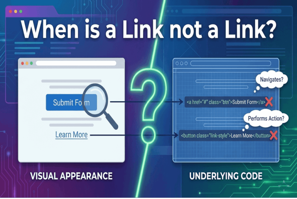
A “Link” That Isn’t a Link
Here is what I found:
<a class="button" style="...">
   <span class=" ">Some Link Text</span>
</a>
At a glance, it looks like a link. It’s even styled like a button. But structurally, it is neither.
An anchor element without an href is not a link. It is not keyboard-focusable by default. It does not participate in the tab order. And it does not communicate any meaningful behavior to assistive technologies.
This single omission effectively removes the element from keyboard navigation entirely.
And yet, visually, nothing appears wrong.
Understanding Intent Versus Implementation
Why would someone build it this way?
The answer lies in intent.
The developer did not want navigation. They wanted an action. Specifically, this “link” was meant to open a modal dialog when clicked with a mouse.
So what we actually have is this:
- An element that looks like a button
- An element coded as a link
- An element that performs an action
- An element that is not keyboard accessible
This is not just a mismatch. It is a violation of the fundamental contract between semantics and behavior on the web.
The First Rule of Semantic HTML
There is a simple principle that governs accessible interaction:
Use links for navigation. Use buttons for actions.
This is not a guideline. It is a contract with users.
Links take you somewhere. Buttons do something.
When we break that contract, we introduce ambiguity, inconsistency, and, ultimately, barriers.
The Shortcut That Creates More Work
So why not just use a button?
In many cases, the decision comes down to perceived efficiency.
Buttons come with default browser styles that need to be reset. Links are often easier to style from scratch. Using an anchor can feel like a shortcut.
But that shortcut comes at a cost.
To make this “link” behave like a button, additional attributes are required:
<a role="button" tabindex="0" class="button" style="...">
   <span class=" ">Some Link Text</span>
</a>
Now we have:
tabindex="0"to force keyboard focusabilityrole="button"to override the element’s semantic meaning- JavaScript to simulate button behavior
And even then, we are still responsible for replicating native keyboard interactions, such as triggering on both Enter and Space.
What started as a shortcut has now become a fragile reimplementation of native functionality.
All of this could have been avoided with a single, correct choice:
<button class="button" style="...">
   <span class=" ">Some Link Text</span>
</button>
The browser handles focus, semantics, and interaction for free.
No workarounds. No ambiguity. No accessibility debt.
Why Automated Testing Missed It
At the start of this analysis, automated tools reported only minor issues. So why didn’t they flag this as a critical failure?
Because this is where automation reaches its limits.
From a purely technical perspective, an anchor without an href is not inherently invalid. There are edge cases, such as JavaScript hooks, where this pattern might appear intentionally.
Automated tools cannot infer intent. They cannot determine whether an element is meant to navigate or perform an action. They evaluate syntax, not experience.
And accessibility is ultimately about experience.
This is why automated testing typically identifies only 30 to 40 percent of accessibility issues. It is effective for catching rule-based violations, but it cannot replace human judgment.
The Real Lesson
Accessibility failures are rarely about missing attributes or incorrect color values. More often, they stem from a misunderstanding of how the web actually works.
HTML is not just a means to render visuals. It is a system of meaning.
When we ignore that meaning, or attempt to override it, we create interfaces that may look polished but fail in practice, especially for keyboard and assistive technology users.
The lesson is simple, but critical:
- Respect native semantics
- Align behavior with meaning
- Test beyond automation
Because accessibility is not achieved when a tool says “pass.”
Accessibility is achieved when the experience actually works.