These three terms are often treated as synonyms. They are not. Conflating them is one of the most common reasons digital products meet standards yet still fail real users.
At a strategic level, accessibility, usability, and inclusion operate as complementary forces. When aligned, they produce experiences that are not only compliant, but effective and meaningful. When treated as interchangeable, they create blind spots.
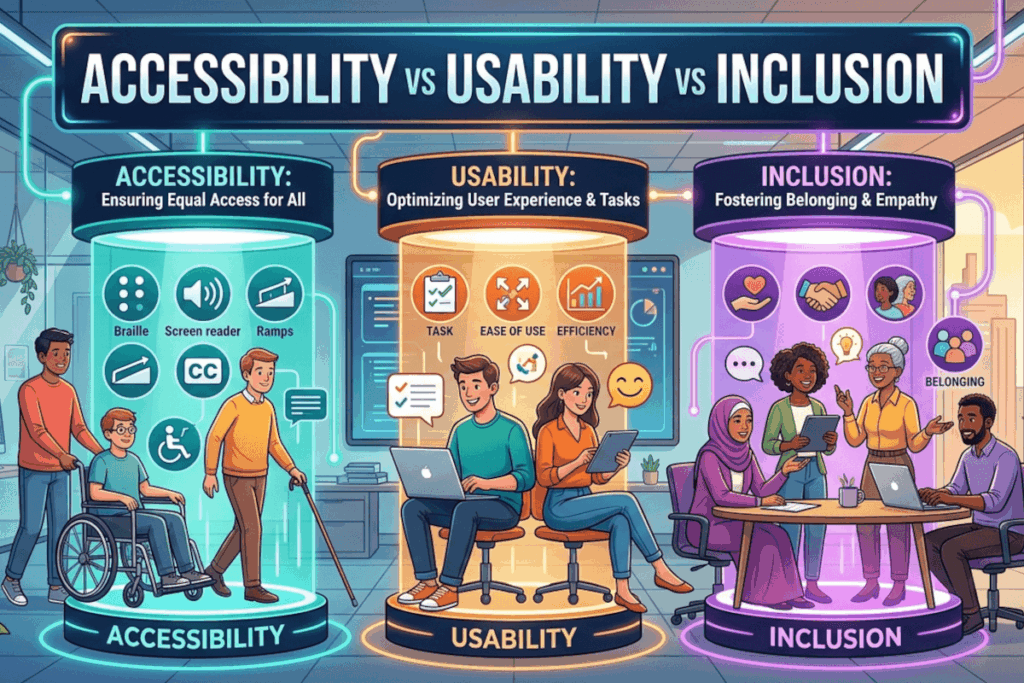
Let’s break this down in practical terms.
Accessibility: Can people get in and interact?
Accessibility is about barrier removal. It ensures people with disabilities can perceive, understand, navigate, and interact with digital content.
Think of accessibility as the baseline for entry.
Real-world example
An e-commerce site includes proper semantic HTML, keyboard navigation, and alt text for images. A screen reader user can browse products, add items to a cart, and complete a purchase.
That is accessibility working as intended.
But accessibility alone does not guarantee a good experience.
Usability: Can people use it efficiently and confidently?
Usability focuses on effectiveness, efficiency, and satisfaction. It asks whether users can complete tasks easily, without confusion or friction.
A product can be fully accessible and still be frustrating to use.
Real-world example
A checkout form is technically accessible, all fields are labeled, errors are announced, and it works with assistive technology. But the form has 25 fields, unclear instructions, and forces users to re-enter information multiple times.
Nothing is “inaccessible,” yet the experience is inefficient and exhausting.
That is a usability failure.
Inclusion: Do people feel considered and represented?
Inclusion expands the lens. It considers whether people from diverse backgrounds, cultures, languages, and lived experiences feel respected and able to participate fully.
It moves beyond function into perception and belonging.
Real-world example
A financial app supports screen readers and is easy to navigate. However, it only offers content in one language, uses culturally narrow imagery, and assumes a single type of financial experience.
Users may be able to use it, but they may not feel it was designed for them.
That is an inclusion gap.
Where things break down
The real risk emerges when organizations optimize for one dimension while ignoring the others.
- Accessible but not usable: A government form passes compliance checks but is so complex that users abandon it midway.
- Usable but not accessible: A sleek mobile app works beautifully for most users but cannot be navigated by keyboard or screen reader.
- Accessible and usable but not inclusive: A platform works well technically, yet excludes users through language, imagery, or assumptions about identity and context.
Each scenario represents a partial success and a complete missed opportunity.
The strategic alignment
High-performing organizations do not treat these as separate workstreams. They integrate them into a unified design and development approach:
- Accessibility ensures access
- Usability ensures efficiency
- Inclusion ensures equity and belonging
This alignment shifts the goal from passing audits to delivering outcomes.
What this means in practice
Evaluating a product through a single lens is no longer sufficient. Compliance checklists, usability testing, and diversity considerations must intersect.
Start by asking three direct questions:
- Can everyone access and operate this experience?
- Can they do so easily and without friction?
- Do they feel considered in how it was designed?
Where the answer is “not quite,” that is where the real work begins.
Call to action
Audit your current product or service across all three dimensions. Identify where you meet accessibility standards but still create friction, or where usability masks exclusion.
The organizations that lead in digital experience are not the ones that choose between accessibility, usability, and inclusion. They are the ones that deliberately design for all three.