Summary
This is an article in a series of articles on digital accessibility posted on Global Accessibility Awareness Day (GAAD) 2026. Want to celebrate and participate? Share this article with others in your digital world.
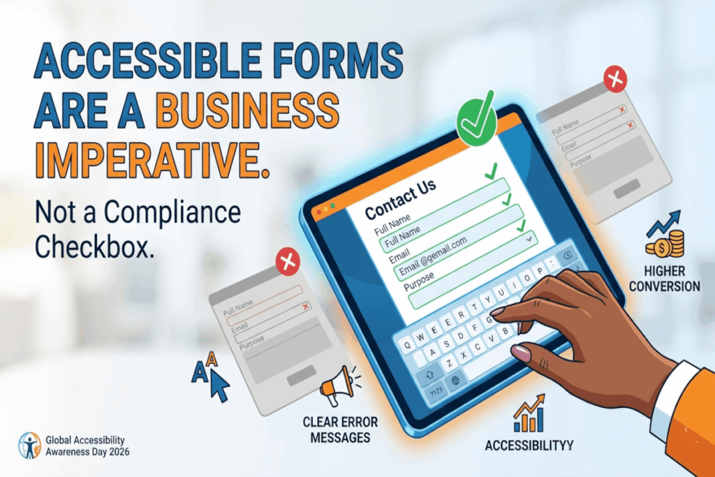
Forms are quietly among the most consequential touchpoints in any digital experience. They are where a curious visitor becomes a subscriber, where intent becomes a purchase, where someone in distress finally requests help. And yet, forms remain one of the most neglected surfaces in web accessibility work. The result is a measurable loss: lost revenue, lost registrations, lost trust, and users who simply give up and leave.
The organizations winning on digital experience have figured out something important: accessible forms are not a concession to compliance. They are a competitive advantage. When forms work for everyone, they perform better for everyone.
Labels are not optional. Placeholders are not labels.
One of the most persistent failures in modern form design is the substitution of placeholder text for proper field labels. Placeholder text disappears the moment a user begins typing, leaving them with no persistent reference to what the field requires. For screen reader users, this is frequently an insurmountable barrier. For users with cognitive disabilities, it creates unnecessary friction.
Every input field deserves a clear, visible, programmatically associated label that remains present throughout the interaction. This is not merely a technical requirement. It is a fundamental act of respect for your users’ attention and effort.
Structure and grouping convey meaning.
Forms are not flat lists of inputs. They are structured information-gathering conversations, and the structure should be visible. Radio buttons, checkboxes, and thematically related inputs need to be grouped logically, using the appropriate semantic elements that convey those relationships to assistive technologies as well as sighted users. When users can perceive the underlying structure of a form, they navigate it more efficiently and make fewer errors.
Instructions belong before the mistake, not after.
If a field has constraints, such as a required format, a minimum character count, a specific date syntax, or a password complexity rule, tell users before they submit. Discovering the rules only after an error is submitted is a design failure that creates unnecessary cognitive load and erodes confidence. This is especially costly for users relying on screen readers, who may need to navigate an entire form again to locate and correct the problem.
The cost of withholding upfront instructions is always paid by your users.
Error messages are a moment of truth.
How a form handles failure reveals a great deal about how much an organization values its users. Vague messages like “invalid input” or “something went wrong” accomplish nothing. They leave users without a path forward and communicate indifference.
Effective error messages identify the specific field and problem clearly, explain in plain language what is needed to resolve it, are easy to locate within the form, and are surfaced in a way that assistive technologies can announce to users who are not visually scanning for changes. Error handling is an opportunity to rebuild trust in a moment of friction, and too few organizations treat it that way.
Keyboard operability is non-negotiable.
A substantial portion of the population navigates the web without a mouse, whether by necessity or by preference. Every input, button, dropdown, and control in your form must be fully operable via keyboard alone. Custom date pickers and bespoke dropdown components are among the most frequent failure points, often built with interaction design in mind but without any consideration for keyboard or assistive technology users. If your custom component cannot be operated entirely by keyboard, it is not ready to ship.
Respecting effort is a design principle.
When a user submits a form and encounters errors, clearing their previously completed fields is an act of hostility. Users have invested time and mental energy in your form. Preserving their progress when an error occurs is the minimum standard of respect for that investment. Multi-step forms that retain data across steps send a clear signal: we value your time.
Simplicity is accessibility.
Long, densely packed forms create barriers for everyone, but they disproportionately affect users with cognitive disabilities, attention difficulties, and situational constraints like poor connectivity or a small screen. Ask only for what is genuinely necessary. Break complex processes into logical, manageable steps. Reduce the cognitive surface area of every form you ship.
This is not just good accessibility practice. It is good product thinking. Shorter, clearer forms convert better across every segment of your audience.
Where to begin
The organizations that will lead on accessible form design are not the ones waiting for the next regulatory update. They are the ones that understand that every barrier in a form is a user who did not complete their task, and every friction point is a signal worth paying attention to.
Start by auditing your highest-value form journey end-to-end. Identify the five most significant barriers a user encounters. Remove them. Then do it again.
Accessible forms are not a project with an end date. They are a practice that compounds over time, and the returns show up everywhere that completion rates matter.