Summary
This is an article in a series of articles on digital accessibility posted on Global Accessibility Awareness Day (GAAD) 2026. Want to celebrate and participate? Share this article with others in your digital world.
Color contrast sits at the intersection of design craft and human consideration. It is one of the most visible accessibility requirements in digital product development, and yet it remains among the most frequently overlooked. This is not because designers lack intention. It is because contrast failures are easy to miss in controlled conditions and reveal themselves only when real people encounter products under real circumstances.
The stakes are higher than many realize. Poor contrast affects not just users with diagnosed low vision or color vision deficiencies, but also people experiencing age-related changes to their sight, fatigue from long work days, or the glare of a mobile screen on a bright afternoon. When we examine the full breadth of who benefits from strong contrast, we quickly realize that accessible design is not a narrow accommodation. It is the design standard that serves everyone better.
What Contrast Actually Means
At its most fundamental level, contrast is the visual difference between a foreground element and its background. Most practitioners default to thinking about text when the subject comes up, but that framing misses a significant portion of the problem. Contrast governs the legibility of icons, the boundaries of form fields, the definition of button shapes, the visibility of focus indicators during keyboard navigation, and the differentiation of data segments within charts and graphs. Status messages, error states, and success confirmations all depend on sufficient contrast to function as intended.
If users cannot clearly distinguish an element, they lose access to the meaning that element was designed to convey. Usability does not degrade gracefully in these situations. It collapses.
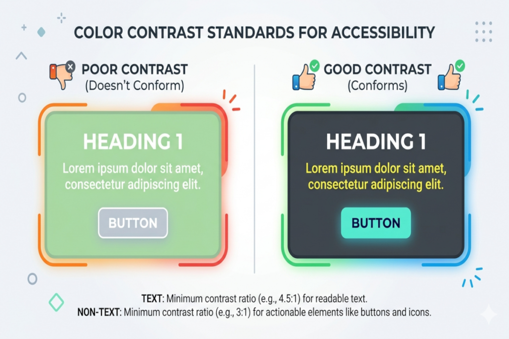
Why Text Contrast Demands Precision
WCAG 1.4.3 Contrast (Minimum) Level AA
The visual presentation of text and images of text has a contrast ratio of at least 4.5:1, except for the following:
- Large Text: Large-scale text and images of large-scale text have a contrast ratio of at least 3:1;
- Incidental: Text or images of text that are part of an inactive user interface component, that are pure decoration, that are not visible to anyone, or that are part of a picture that contains significant other visual content, have no contrast requirement.
- Logotypes: Text that is part of a logo or brand name has no contrast requirement.
Body text, navigation labels, form controls, and interactive elements exist to transfer information efficiently. Small, thin, low-contrast type often reads as refined in design mockups viewed on calibrated monitors in dimly lit studios. That same type performs poorly for people reading on older displays, in motion, or under stress. Elegance that does not survive contact with actual users is not elegance. It is a liability.
The standard exists not to constrain creative ambition but to ensure that the information we work to communicate actually reaches the people it is intended to reach.
Non-Text Contrast Deserves Equal Attention
WCAG 1.4.11 Non-text Contrast (Minimum) Level AA
The visual presentation of the following have a contrast ratio of at least 3:1 against adjacent color(s):
- User Interface Components: Visual information required to identify user interface components and states, except for inactive components or where the appearance of the component is determined by the user agent and not modified by the author;
- Graphical Objects: Parts of graphics required to understand the content, except when a particular presentation of graphics is essential to the information being conveyed.
There is a persistent misconception that contrast requirements apply only where words appear. In practice, a button border communicates interactivity. A selected state communicates a user’s current position within a system. A focus ring communicates where keyboard input will land. A chart segment communicates a data category. None of these elements contain text, and yet all of them carry critical meaning.
When these non-text elements blend into their backgrounds, users do not simply experience mild inconvenience. They miss functionality entirely. Forms are submitted incorrectly. Navigation paths are misread. Errors go unnoticed.
The Persistent Problem of Color-Only Communication
WCAG 1.4.1 Use of Color Level A
Color is not used as the only visual means of conveying information, indicating an action, prompting a response, or distinguishing a visual element.
Color alone is an insufficient signal. This is a foundational principle, and it is violated constantly. Errors displayed only in red rely on the assumption that every user perceives red as alerting, which is not true for a substantial portion of the population. Required fields indicated only by a color shift present an invisible barrier to users who cannot distinguish that shift. Selected states communicated only through tint changes disappear entirely under certain display conditions.
The discipline required here is straightforward: pair color with an additional signal. An icon, a label, a pattern, a text indicator. Each addition transforms a color-dependent communication into a robust one. This is not redundancy. It is reliability.
Building Contrast Into Systems Rather Than Checking It After the Fact
The most common failure mode in contrast management is treating it as an audit step that happens late in the design and development process. At that stage, contrast failures are expensive to fix. Brand colors may need to be revisited. Component libraries may require updates. Developer time gets redirected to rework that could have been avoided entirely.
The more productive approach is to define accessible color tokens and approved pairings at the system level, before any individual product decisions are made. When designers and developers work from a palette that has already been validated for contrast compliance, they move faster and make fewer errors. The conversation shifts from “is this accessible?” to “here are our accessible options, which do we prefer?”
This is what it means to embed accessibility into process rather than treating it as an external check.
The Limits of Controlled Testing
Contrast that appears acceptable in a design review does not always remain acceptable in the field. Color rendering varies meaningfully across device types, monitor calibrations, brightness settings, and ambient lighting conditions. What holds at a workstation may fail on a mobile display in direct sunlight. What holds on a high-end monitor may collapse on an aging screen in a less-resourced context.
Real-world testing across a range of devices and conditions is not a nice-to-have. It is the only way to know whether contrast decisions actually serve the people a product is meant to reach.
A Reframe Worth Making
Color contrast is not a limitation placed on creative work. It is a condition that makes creative work functional. Communication design that cannot be perceived is not design at all. It is decoration that excludes.
The organizations that treat contrast as a foundational quality criterion rather than a compliance checkbox tend to ship products that feel more polished, serve broader audiences, and require less remediation over time. That combination of outcomes is worth building toward deliberately.
The first practical step is concrete: audit your brand palette and establish a documented library of accessible color pairings that designers and developers can reference with confidence. Make the right choice the easy choice, and the quality of every subsequent design decision improves along with it.