
To start the “Baby Steps Accessibility” series, I thought we’d start with the #1 accessibility problem impacting the digital world; color contrast.
Per The WebAIM Million report, low contrast text represents 79.1% of all errors on the 1M homepages they analyzed via automated testing.
| WCAG Failure Type | % of home pages |
|---|---|
| Low contrast text | 79.1% |
| Missing alternative text for images | 55.5% |
| Missing form input labels | 48.2% |
| Empty links | 45.4% |
| Empty buttons | 29.6% |
| Missing document language | 15.8% |
People with low vision often struggle with text that blends into its background, especially if they also have a color vision deficiency. And as people like you and me age, this becomes especially important. Ensuring a minimum contrast ratio between text and background makes it easier to read, even for those who see limited or no color.
There’s an entire deep-dive on the Web Content Accessibility Guidelines (WCAG) success criteria that applies to text color contrast, which is important. However, as the focus on this series is towards folks just getting started, and really don’t know what WCAG is, this post is just to get folks progressing on accessibility improvements early on, you can follow the previous link as interested.
Early on, you are going to exclusively use tools to determine sufficient color contrast. As you become more experienced, you’ll be able to “eyeball” many of this issues before proving out your assumptions.
Testing for Color Contrast of Text
So what is an accessibility issue for color contrast? Basically, when the text color and the background color the text sits on is not sufficient, it make that text difficult you see and read. And remember, while you may be able to see and read it, others with impaired vision may not.

In the prior example, the letter “T” in a green color is sitting on top of a lighter green background. Before there is insufficient color contrast between these two colors, this would fail conformance to the WCAG success criteria previously mentioned.
There are several ways to text for color contrast of text, using publicly available tools.
Built-in browser tools
Within the browser you are using to view this article, you have handy tools to identify the color contrast of text on a web page. Let’s first look at Google Chrome.
Load a web page that you wish to inspect. Right click on the text you wish to check contrast for, then from the contextual menu, select Inspect. This should present the Chrome dev panel.
Note the first control in the menu bar of the dev panel (highlighted in the following screenshot).
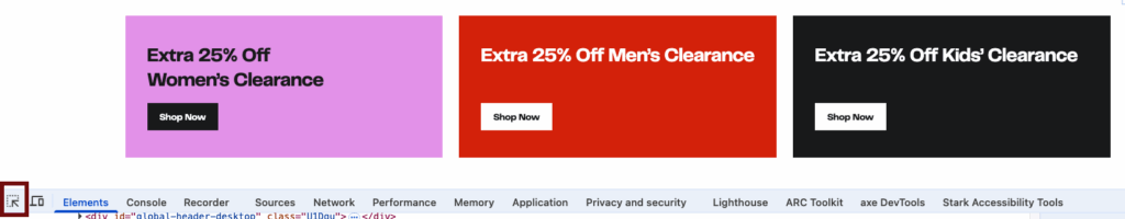
Activate this button, then hover over the text you wish to check. As an example, let’s click on the white text in the bright red square.
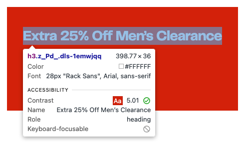
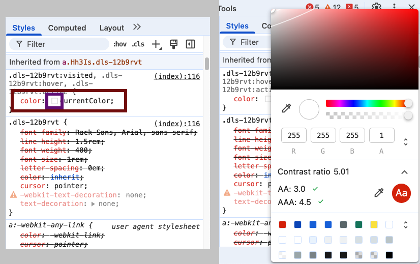
Another way you can get this information from the Chrome dev panel is by selecting the color swatch for the element in the Styles panel of the dev panel.
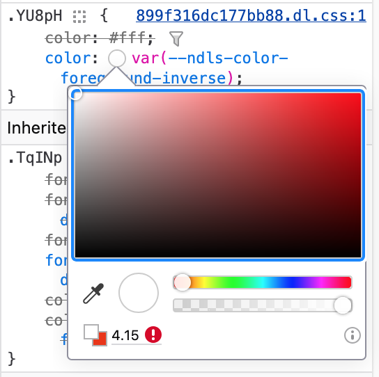
Firefox works in a similar fashion, yet not as robust. Performing the same actions as the prior steps to show the color properties in Chrome also presents a popup. This popup presents similar information to Chrome, with an exclamation character in a red circle identifying color contrast issues.
Safari on the Mac has a color properties feature similar to Chrome and Firefox, however it does not provide color contrast information for accessibility. Safari can be extended through browser extensions to provide additional information.
Browser extensions
If manual discovery of color contrast issues is not your thing, consider one of the many accessibility browser extensions available. These browser extensions include tests for color contrast of text. Some of the more popular extensions include the ARC Toolkit and axe DevTools.
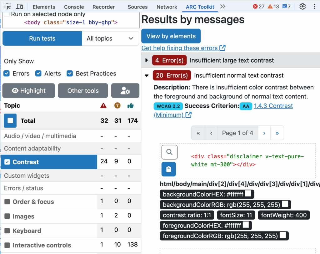
After running a scan of the page, the browser extension will report on all accessibility issues that can be identified by automated testing (about 30-40% of all issues). The good news is, around 80% of color contrast issues can be identified via automated testing. An example of a color contrast of text issue that cannot be identified via automated testing includes text over a photographic image; these scenarios will need to be tested another way. Queue up the manual eyedropper tool.
Manual color contrast eyedropper tool
In certain situations, you may need a different tool to identofy color contrast issues. These situations include, but are not limited to:
- text over photographic images
- text embedded in images
- non-web-based content, such as PDFs
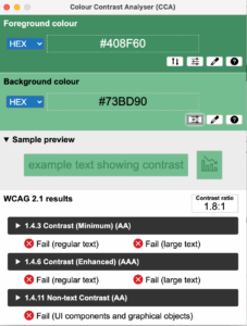
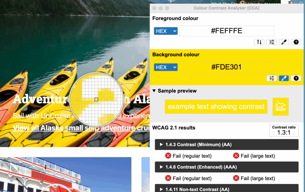
In these situations, it is best to use a manual color contrast tool which offers an eyedropper tool to manual select the pixel that best represents the color you wish to check. An example of this type of tool includes the Colour Contrast Analyser (CCA).
This tools allows you to select both the foreground and the background colors manually. When you select the eyedropper tool for the foreground color, a magnifying glass-feature is shown that allows you to select a color by clicking on a individual pixel. You repeat this process for the background color. Note: for text over photographic images or gradients, for the foreground color, select a text area that is solid and not gradient, such as a straight region, either vertical or horizontal. For the background color, look for a region of color that most closely aligns with the foreground color.
Exceptions to Color Contrast of Text
There are a few scenarios where text does not need to conform to sufficient color contrast. These include:
- logotype
- text that is part of an inactive user interface component
- text that is purely decorative
- text that is part of a picture that contains significant other visual content
What is sufficient color contrast of text?
Once you’ve identified the text that failed color contrast, you need to know what contrast ratio is sufficient.
- regular-sized text (less than 24 CSS pixels) has a contrast ratio of at least 4.5:1
- large-sized, normal-weight text (24 CSS pixels or greater) or bolded regular-sized text has a contrast ratio of at least 3:1
Summary
Checking the color contrast of your digital products is a low-hanging fruit exercise. It can be done with a limited degree of experience and resources. And doing so will provide extra time for your design team to address any global changes.
Also, don’t pressure yourself to think you must do everything, all at once. Do a little at a time, prioritizing text again the primary color palette of the site. A little goes a long way to making inroads in your baby steps accessibility.


One thought on “Baby Steps Accessibility – Color Contrast of Text”
Comments are closed.