Note: The creation of this article on testing Contrast (Minimum) was human-based, with the assistance on artificial intelligence.
Explanation of the success criteria
WCAG 1.4.3 Contrast (Minimum) is a Level AA conformance level Success Criterion. It ensures text and images of text have a contrast ratio of at least 4.5:1 against their background. There are a few exceptions to this rule:
- Large text or large-scale text images must have a minimum contrast ratio of 3:1.
- No contrast requirement applies to text that is decorative, hidden, part of an inactive UI element, or within an image containing meaningful visual content.
- Logos and brand names are also exempt from contrast requirements.
There is deep level of menusha around this particular success criterion, that I will leave to the experts that contributed to this success criterion at the W3C. However, it is an important read.
One confusing aspect to this success criterion is the applicable font size. The success criterion references points (pt) versus the more commonly used pixels (px), which also feels outdated, as most modern guidance uses relative values, such as em, rem, % etc. Since 1pt equals 1.333px, 14pt and 18pt convert to roughly 18.5px and 24px, respectively. See the entire section in the Understanding documentation on font sizes.
According to the 2025 WebAIM Million report, low color contrast was the most common accessibility issue across the top one million home pages. Text falling below WCAG 2 AA contrast thresholds appeared on 79.1% of pages, with an average of 29.6 instances per page, a 14.4% drop from 34.5 in 2024.
Personal opinion: Contrast (Minimum) is a success criterion that is “low handing fruit,” that should be addressed before any formal review of your digital product. Get your design team involved by testing color palettes used, foreground colors against background colors. You’ll catch the 80% of issues early and have more time to determine appropriate changes.
Who does this benefit?
- People with low vision or color blindness may struggle to read low-contrast text. Ensuring a minimum luminance contrast improves readability, even for those who see little or no color.
Testing via Automated testing
Automated tools quickly scan entire websites, flagging thousands of contrast issues in seconds with precise, consistent results. Many integrate into development pipelines and highlight failures directly on the page, helping teams catch problems early and fix them efficiently.
However, these tools only test visible HTML text, not text in images, canvas, or third-party content. They can’t determine if text is decorative, hidden, or exempt, and may miss issues with dynamic states, gradients, or overlays. They also don’t suggest better color choices or evaluate real-world usability and design impact.
Testing via Artificial Intelligence (AI)
AI-powered contrast testing sees what basic automated testing scanners miss. It tells logos from body text, reads gradients and image backgrounds, and ranks issues by user impact, surfacing tricky low‑contrast spots at scale while simulating how people with color‑blindness or low vision perceive the page.
But it’s no silver bullet. AI can mis‑tag decorative text, miss hover or dynamic states, and rarely explains its decisions, so human review remains essential to verify intent and catch edge cases for full WCAG compliance.
Testing via Manual testing
Manual testing brings valuable context, allowing testers to judge contrast based on text size, weight, and background complexity, and to decide whether content is decorative or meaningful. It’s especially effective for spotting issues with gradients, images, or hover states that automated tools often miss. Unlike pure calculations, humans can assess true legibility, and even non-coders can check contrast using basic tools.
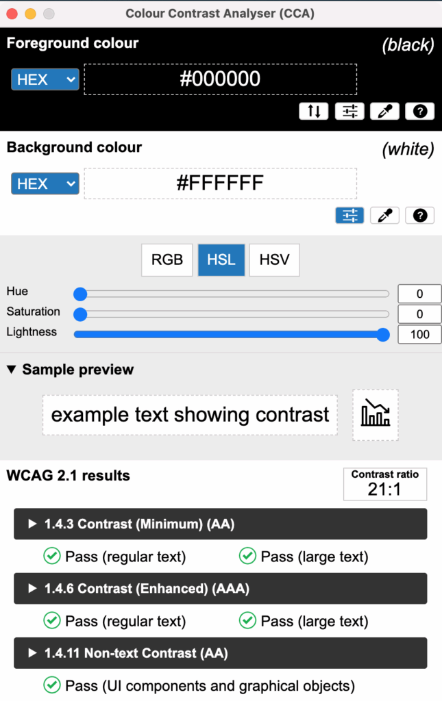
This brings up an ironic point. In most manual testing for color contrast, some type of tool is used to identify conformance (or not) to the WCAG success criterion. There are a plethora of color contrast checkers, from WebAIM’s Contrast Checker and Link Contrast Checker, Lea Verou’s/ siegemedia’s Contrast Ratio tool (my favorite web-based tool), and TPGi’s Colour Contrast Analyser (my favorite overall client-based tool).
However, manual testing is time-consuming and hard to scale across large or dynamic sites. It can be error-prone, misjudging transparency, states, or selecting the wrong pixel. Without clear guidelines, testers may also miss subtle issues or misclassify content.
Which approach is best?
No single approach for testing 1.4.3 Contrast (Minimum) is perfect. However, using the strengths of each approach in combination can have a positive effect.
The best way to test WCAG 1.4.3 Contrast Minimum blends automated, AI-powered, and manual checks. Automated tools swiftly catch common low-contrast issues, while AI tackles tricky cases like text over gradients or dynamic backgrounds. Manual testing rounds it out by verifying edge cases, distinguishing essential from decorative text, and ensuring real-world readability across devices and zoom levels. Together, they deliver thorough and reliable results.
Related Resources
- Understanding WCAG Success Criteria 1.4.3 Contrast (Minimum)
- mind the WCAG automation gap
- A11y 101: 1.4.3 Contrast (Minimum)
- The WebAIM Million 2025 Report – Color Contrast
- TPGi’s Colour Contrast Analyser
- WebAIM’s Contrast Checker
- WebAIM’s Link Contrast Checker
- Lea Verou’s/ siegemedia’s Contrast Ratio tool