Note: The creation of this article on testing Focus Visible was human-based, with the assistance of artificial intelligence.
Explanation of the success criteria
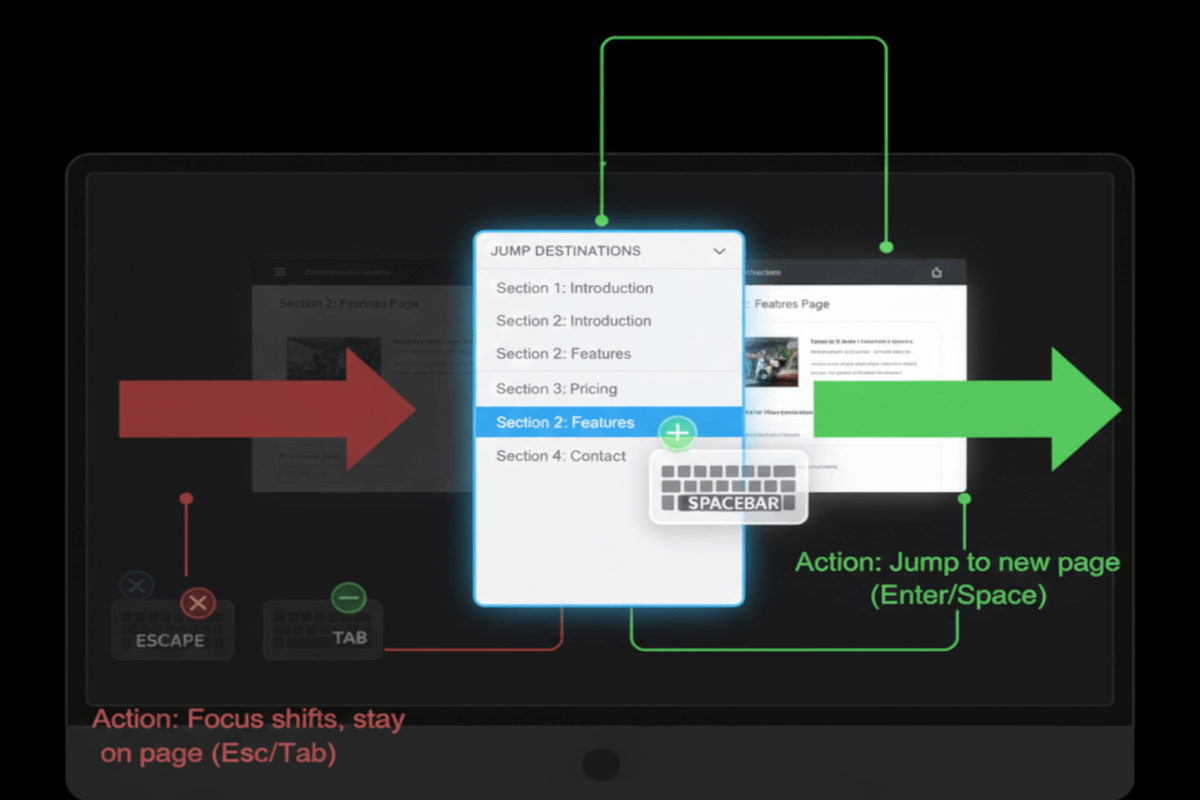
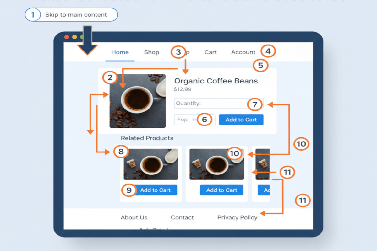
WCAG 2.4.7 Focus Visible is a Level AA conformance level Success Criterion. It ensures that every interactive element, buttons, links, form fields, shows a clear, visible indicator when it receives keyboard focus. This visual cue anchors users who navigate without a mouse, letting them know exactly where they are on the page and what they’re interacting with. Without it, users who rely on keyboards, switch controls, or assistive devices can easily lose context, interrupting the flow of interaction and creating unnecessary friction.
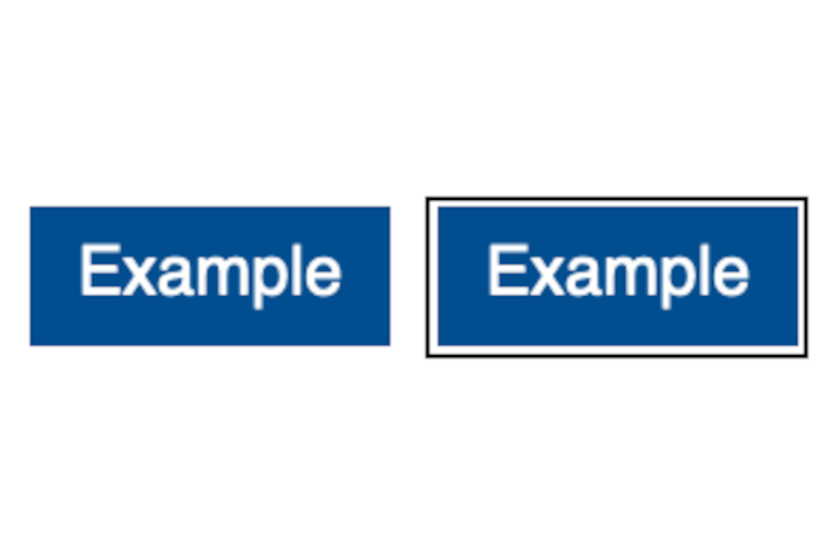
A visible focus can take many forms, an outline, underline, color shift, or glow, but it must be noticeable. Subtle design choices, like a faint outline or near-invisible color change, often fail real users, particularly those with low vision or color deficiencies. A strong focus state doesn’t just meet a requirement; it communicates clarity and intent. When implemented consistently, it guides users seamlessly through content and creates a visual rhythm that makes digital experiences easier for everyone.
In practice, success requires balance. Default browser outlines are accessible but may clash with brand aesthetics, leading many teams to remove them without providing accessible replacements. The best approach customizes focus indicators that both align with the brand and remain unmistakably visible. Testing across browsers, devices, and high-contrast modes ensures that focus indicators hold up under real-world conditions. A well-designed focus state is more than a compliance checkbox, it’s a visible signal of inclusion and thoughtful design.
Who does this benefit?
- Keyboard-only users, who depend on visible focus to navigate and interact efficiently.
- Users with motor disabilities, who rely on adaptive devices like switch controls or mouth sticks to move through content.
- Users with low vision, who need clear, high-contrast indicators to maintain orientation.
- Users with cognitive disabilities, who benefit from clear visual cues that reduce confusion and cognitive load.
- Screen magnifier users, who use visible focus to locate active elements without excessive scrolling or panning.
- Developers and testers, who gain predictable navigation patterns and prevent regressions.
- All users, who experience smoother, clearer navigation and better overall usability.
Testing via Automated testing
Automation delivers speed and scale. Tools like axe-core or Lighthouse can identify missing or overridden focus styles, report when elements are unreachable via keyboard, and catch contrast issues in focus outlines. However, automated tools can’t determine whether a focus indicator is actually visible or perceivable within context. They operate on code rules, not human experience. This makes automation an essential, but incomplete, first layer of testing.
Testing via Artificial Intelligence (AI)
AI-driven tools bring visual intelligence to the process. By simulating keyboard navigation, capturing screenshots, and comparing visual states, AI can detect whether a perceivable change occurs when focus moves. It bridges many of the gaps left by pure automation, identifying hidden focus states or inconsistent styling across components. Still, AI can’t fully grasp the user experience. It may misinterpret decorative elements or subtle transitions, which means human oversight remains essential.
Testing via Manual Testing
Manual testing is where accessibility meets reality. By navigating entirely with a keyboard, testers evaluate whether focus indicators are truly visible, consistent, and usable. They validate color contrast, detect focus loss in dynamic interfaces, and confirm that users can follow the focus across different views and conditions. Manual testing captures the nuances automation and AI cannot, making it indispensable for ensuring real-world accessibility and user trust.
Which approach is best?
No single testing method for WCAG 2.4.7 Focus Visible is enough. The most effective approach layers automation, AI, and manual validation for full coverage.
Automated testing serves as the foundation of a sustainable accessibility strategy. When integrated into continuous integration and delivery (CI/CD) pipelines, it provides proactive oversight, flagging regressions before they reach production. Automated scans can quickly detect missing or suppressed focus indicators, such as elements that have outline: none without a visible replacement, or confirm when components have lost their tab order or keyboard reachability. This approach is especially powerful at scale, ensuring that accessibility regressions are caught early in the development cycle, not retrofitted after launch. While automation can’t assess whether the focus indicator is truly perceivable to a human eye, it builds the discipline of accessibility into the fabric of software delivery, shifting accessibility testing left and reinforcing accountability across teams.
AI-based testing elevates this process by introducing visual intelligence and context awareness. Rather than relying solely on code inspection, AI simulates real keyboard navigation, tabbing through interactive elements, capturing screenshots, and analyzing visual states before and after focus. It evaluates whether a genuine visual change occurs and whether that change meets thresholds of contrast and visibility across different backgrounds and layouts. This allows teams to catch subtle failures that traditional automation misses, like faint outlines on complex imagery or focus rings that disappear in dark mode. AI also enables continuous visual regression testing, learning from design patterns over time to recognize deviations that could impact accessibility. In essence, AI bridges the gap between code-based logic and human perception, helping teams scale accessibility quality assurance without compromising depth.
Manual testing remains the cornerstone of meaningful accessibility validation. Human testers bring the nuance, empathy, and contextual awareness that no tool can replicate. By navigating interfaces using only a keyboard, and ideally, under varied conditions such as high contrast mode, zoomed displays, or assistive technologies, testers can determine whether focus indicators are not just present, but usable and intuitive. Manual testing exposes real-world friction: inconsistent focus visibility across components, lost focus after modal interactions, or indicators that blend into dynamic backgrounds. It’s also where accessibility meets user experience, where design intent, usability, and inclusion converge. While it requires more time and expertise, manual testing ensures that focus visibility translates into genuine navigational confidence for every user, solidifying accessibility not as a technical requirement, but as a hallmark of thoughtful, human-centered design.
Together, these methods form a comprehensive accessibility strategy, automation for efficiency, AI for intelligent detection, and manual testing for authentic, user-centered validation.
When executed well, this success criteria isn’t just a compliance requirement, it’s a design discipline. Visible focus is how we tell users, “You’re seen, you’re supported, and you’re in control.” That’s not just accessibility, it’s good design.
Related Resources
- Understanding Success Criterion 2.4.7 Focus Visible
- mind the WCAG automation gap
- Using user interface components that are highlighted by the user agent when they receive focus
- Using CSS to change the presentation of a user interface component when it receives focus
- Using the default focus indicator for the platform so that high visibility default focus indicators will carry over
- Using an author-supplied, visible focus indicator
- Creating a two-color focus indicator to ensure sufficient contrast with all components
- Using CSS :focus-visible to provide keyboard focus indication
- Using script to change the background color or border of the element with focus
- A11y 101: 2.4.7 Focus Visible