Social media is among the most powerful communication channels organizations have. We use it to launch products, announce events, share research, recruit talent, and build communities.
But there’s an uncomfortable truth behind all that reach: the accessibility of your content depends partly on someone else’s platform.
You can write meaningful alt text, produce accurate captions, and use clear language, and still land on a platform that gives you no place to put any of it. That doesn’t erase your obligation. It changes the problem.
So stop asking, “Does this platform support accessibility?”
Ask instead: “How can I communicate the same information accessibly, given what this platform allows?”
That one shift turns accessibility from a checklist into a content strategy.
The Gap Is Real, and It’s No Excuse
The major platforms have made real progress, but support remains uneven. A feature may exist for a standard post but not a Story. A platform may generate alt text automatically and then block you from editing it. Another may support captions but offer no way to deliver audio description.
“The platform doesn’t let me” is a tempting excuse. Don’t take it.
The Web Accessibility Initiative reminds us that social platforms are authoring tools. They must work for the people creating content, and they must help those creators produce content that works for everyone else. Accessibility has two audiences: the person posting and the person reading, watching, or listening. You are responsible for the second one, whatever the first one’s tools allow.
Images: Alt Text Is the Start, Not the Finish
Good alt text doesn’t transcribe everything in an image. It conveys the image’s purpose and the information the reader needs.
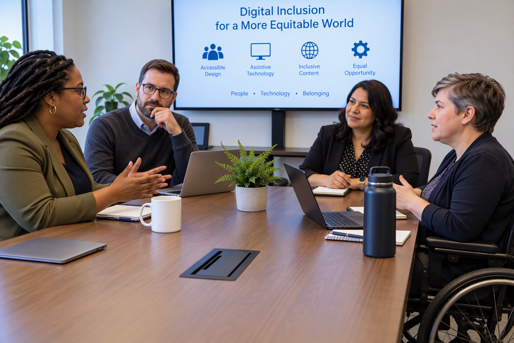
- Weak: “People sitting around a table.”
- Better: “Four accessibility professionals discuss digital inclusion around a conference table.”
When a platform offers no alt text field, describe the image in the post itself. That has a bonus: the description helps everyone, not just assistive technology users.
The same logic applies to text inside graphics. If a quote card or flyer says “Registration closes Friday at 5:00 PM,” put that detail in the post text too. Text in a post is searchable, selectable, scalable, and translatable. Pixels are not.
The principle underneath: never lock essential information behind a single sensory channel.
Video: Captions Solve Only Half the Problem
Captions matter. They serve people who are deaf or hard of hearing, and also viewers in noisy rooms, language learners, and anyone watching on mute. But auto-generated captions stumble on names, acronyms, numbers, and multiple speakers. Review them before you publish.
Even perfect captions leave a gap. Consider a presenter who says, “As you can see on this chart, accessibility defects dropped by 40%.” The caption captures the sentence but not the chart.
If the platform has no audio description, build the description into the script: “This chart shows accessibility defects falling 40%, from 100 in January to 60 in June.” You can also add a short video description to the post. It’s less seamless than integrated audio description, but far better than silence.
For audio-only content like podcasts, publish a transcript. If the platform has no field for one, host it on an accessible page and link to it.
Small Details, Real Impact
Emojis. Screen readers announce every emoji by name, so a string of fourteen clapping hands becomes a wall of repetition. Use emojis sparingly, and never in place of words. If removing the emoji changes the meaning, write the meaning in words.
Decorative characters. Fancy Unicode “bold” text, ASCII art, and text-based emoticons produce unpredictable results in assistive technology. Standard text communicates the same idea reliably.
Hashtags. Write #DigitalAccessibility, not #digitalaccessibility. Capitalizing each word improves readability and helps screen readers pronounce the phrase correctly. It costs nothing.
Color. Color can reinforce meaning, but it can’t carry it alone. Write “items labeled ‘High Risk’ require remediation,” not “the red items require remediation.”
The Platform Limitation Playbook
When a platform lacks the feature you need, work down this hierarchy:
- Use the native feature. If the platform offers editable alt text or caption uploads, use them.
- Put the equivalent in the post. Describe the image in the text, burn in open captions, or narrate the visuals.
- Move the accessible version elsewhere. Link to a transcript or image description on an accessible webpage. The post distributes; your website delivers.
- Change the format. Sometimes the most accessible choice is a different one: HTML text instead of a text-heavy infographic, a written announcement instead of audio-only, a video where the presenter describes the visuals aloud.
Accessibility sometimes means changing the content strategy, not just filling in a field.
Build It In, Don’t Bolt It On
Organizations most often fail by treating accessibility as the last step before publishing. By then, the format may already rule out a good solution.
Ask the questions early. Which parts of this message are visual? Which are auditory? Can it work without either? Does the platform support what I need? Then verify before you post: Does every meaningful image have a text alternative? Are captions accurate? Does the post make sense without color? Is the key information available as text?
Aim for Equivalence
The real test isn’t “Did I use the accessibility feature?” It’s “Can people with different disabilities access the same essential information and meaning?”
A flawless alt text field doesn’t rescue an infographic whose key data the alt text omits. Captions don’t make a video accessible if critical visuals go unexplained. A feature doesn’t guarantee accessible content. People do.
Platforms will keep improving, and they’ll keep having gaps. So don’t build your strategy around any one platform’s features. Build it around the information your audience needs. The platform is only the delivery mechanism.
These practices aren’t accommodations. They’re better communication. Describing images sharpens what matters in them. Captions make messages work without sound. Transcripts turn fleeting audio into searchable knowledge.
The most mature organizations won’t ask whether accessibility is possible on a given platform. They’ll ask what their audience needs, then design the message to deliver it.
Because the platform isn’t the product. The message is. And if part of your audience can’t access it, your communication strategy is incomplete.
Coming Next
Knowing the principles is one thing; knowing what each platform actually lets you do is another. In the next article, we’ll compare the accessibility capabilities of the major social media platforms, covering what’s supported, what’s missing, and where you’ll need workarounds, so you can plan your content before you publish.