You own the barrier, even when you did not build the chatbot
When a third-party chatbot fails a keyboard or screen reader user, your organization takes the complaint, the legal exposure, and the lost customer. The vendor’s logo on the widget does not move any of that.
I see the same pattern in audits. Teams hold their own templates to WCAG 2.2 AA, then paste in a vendor script that injects a launcher, a dialog, and a live conversation into every page. That script arrives late, sits outside the design system, and often lives inside an iframe or shadow DOM that automated scanners skip. The result is the one component on the page that people with disabilities most need (help) and the one least likely to work for them.
WCAG does allow a statement of partial conformance for third-party content that the author cannot control. That statement describes the situation honestly. It does not shield you from a user who cannot reach support, and it does not satisfy a regulator or a plaintiff. The practical answer is to test the chatbot before you buy it, test it again after every vendor release, and send the vendor evidence it can act on.
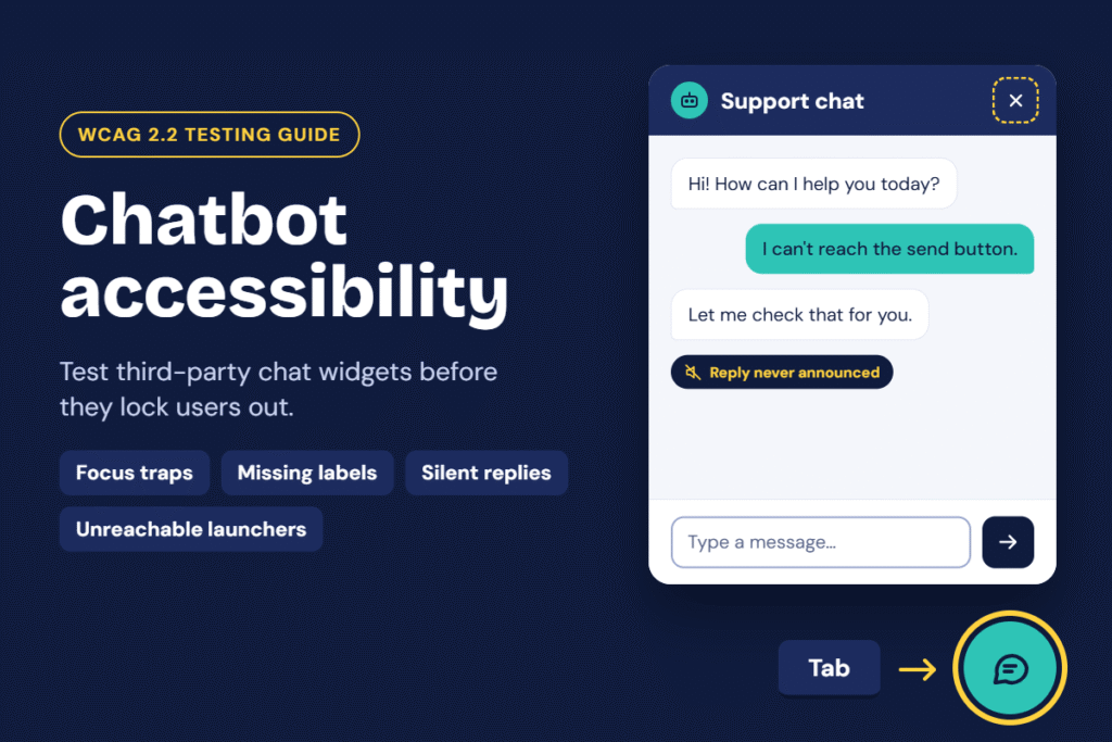
This article covers four failures I find most often, how to test each one, the WCAG 2.2 Success Criteria they violate, and how to write a defect report that gets fixed.
Four failures that appear in most chatbot widgets
A chatbot fails in predictable places because vendors build for mouse users first and bolt on assistive technology support later. These four failures account for most of the blocking defects I see.
A chatbot fails in predictable places because vendors build for mouse users first and bolt on assistive technology support later. These four failures account for most of the blocking defects I see.
1. Focus traps
A focus trap happens when keyboard focus enters the chat window and cannot leave. The widget captures Tab, ignores Escape, and offers no visible close control in the tab order. A second variant is the reverse: the dialog opens, but focus stays on the page behind it, so a keyboard user tabs through the whole site to reach the input field. A third variant lets focus escape the open dialog into the page, where it lands on content the chat window covers.
Users who navigate by keyboard, switch device, or screen reader lose the ability to continue using the site. This is a blocking barrier, not an inconvenience.
2. Missing labels
Chat widgets rely on icon buttons: a speech bubble to open, an X to close, a paperclip to attach, an arrow to send. Developers often build these as div or span elements with background images and no accessible name. The text input frequently carries only a placeholder, which disappears when the user types and which many screen readers do not announce as a label. Iframes that host the widget often lack a title.
A screen reader user hears “button” or “edit text” with no indication of what either one does.
3. No screen reader announcements for new messages
A sighted user watches the bot’s reply appear. A screen reader user hears nothing, because the widget never tells assistive technology that new content arrived. Vendors also fail in the opposite direction: they announce every message twice, re-read the entire transcript on each reply, or announce the typing indicator so often that it drowns the answer.
Without a working announcement, the user must hunt through the transcript after every message to find out whether the bot replied.
4. Keyboard-inaccessible launchers
The floating launcher is the front door, and vendors frequently build it as a clickable div with a mouse handler and no keyboard handler. Others place it at the end of the DOM so a keyboard user must tab through the entire page to reach it, or hide it from the tab order entirely. Small launchers also miss the minimum target size, and the launcher can cover page content or other controls at high zoom.
If a user cannot open the chat, the other three problems never matter, which makes this the most severe failure of the four.
Related problems worth checking in the same pass
- Contrast and non-text contrast on the launcher, the message bubbles, and the send button.
- Reflow and zoom: the window overflows or hides the input field at 200% and 400% zoom or at a 320 CSS pixel viewport.
- Session timeouts that end a conversation without warning.
- Looping animations, such as bouncing launchers or pulsing typing dots, that never stop.
- Rich message types (carousels, quick-reply buttons, forms inside the chat) that lack keyboard support.
- Authentication or CAPTCHA steps that require a cognitive test, and chat flows that ask users to re-enter information they already gave.
How to test a chatbot, step by step
Test on a real page, not the vendor’s demo. Set up once, then run each procedure below.
Set up your test environment
- Use a production-like page with the vendor’s script loaded exactly as you will deploy it, including your configuration, theme, and any greeting or proactive pop-up.
- Record the widget version, the browser and version, the operating system, the screen reader and version, and the date. The vendor needs these to reproduce a defect.
- Test at least two screen reader and browser pairs. I use NVDA with Firefox and Chrome on Windows, JAWS with Chrome, and VoiceOver with Safari on macOS and iOS. Add TalkBack with Chrome on Android if mobile traffic matters.
- Open browser developer tools and keep the accessibility tree panel visible. Note whether the widget sits inside an iframe or a shadow root, because that changes how you inspect it.
- Run an automated scan (ARC Toolkit, axe DevTools, WAVE, or Accessibility Insights) as a first pass. Treat it as a floor: automated tools catch only a fraction of real barriers, and many skip content inside iframes.
Test 1: Launcher and keyboard access
- Load the page and press Tab from the top of the document. Count how many presses it takes to reach the launcher.
- Confirm the launcher shows a visible focus indicator that meets contrast requirements and no part of it hides behind a sticky header, cookie banner, or other overlay.
- Press Enter, then reload and press Space. Both keys must open the chat.
- Inspect the element. It should be a native
button(or carry an equivalent role), expose an accessible name such as “Open chat”, and expose its expanded or collapsed state. - Measure the target. The clickable area should be at least 24 by 24 CSS pixels, or have enough spacing around it to meet the exception.
- Zoom to 200% and 400%, then resize to 320 CSS pixels wide. Confirm the launcher stays reachable and does not cover the content or controls beneath it.
- Test with voice control (Dragon or macOS Voice Control). Say “click open chat” and confirm the spoken name matches the visible label.
Fail if: you cannot open the chat with the keyboard alone, the launcher has no accessible name, or it takes more than a handful of Tab presses with no skip mechanism and no consistent placement.
Fail if: you cannot open the chat with the keyboard alone, the launcher has no accessible name, or it takes more than a handful of Tab presses with no skip mechanism and no consistent placement.
Test 2: Focus management and traps
- Open the chat with the keyboard. Focus should move into the chat window, to the dialog itself or to the message input.
- Press Tab repeatedly and Shift+Tab repeatedly. Focus should cycle through every control in the window in a logical order: messages, input, send, attachments, minimize, close.
- Press Escape. The chat should close, or at least offer a documented keyboard method to leave it.
- After closing, confirm focus returns to the launcher, not to the top of the page or to nowhere.
- Open the chat, then try to Tab out of it. If the vendor intends a modal, focus should stay inside and the page behind should become inert. If the chat is non-modal, focus should leave it cleanly in both directions.
- Send a message and wait for the reply. Focus must not jump to the reply, to the top of the transcript, or out of the input field.
- Open quick-reply buttons, carousels, and forms inside the chat. Confirm each one works with the keyboard and focus does not get lost when the widget re-renders.
Fail if: focus gets stuck, escapes behind an open modal, disappears after an update, or never returns to the launcher.
Test 3: Labels, names, and roles
- In the accessibility tree, list every interactive element inside the chat: launcher, close, minimize, send, attach, emoji, rating, and the message input.
- Confirm each element has a meaningful accessible name and the correct role. Icon-only buttons need a text alternative, not a tooltip alone.
- Check the input. It needs a programmatic label (a
label,aria-label, oraria-labelledby), not only placeholder text. - Check the container. A dialog should carry
role="dialog"(or use a nativedialog) with an accessible name, and the chat iframe needs a descriptivetitle. - Check that visible labels match accessible names. A button that reads “Send” should not expose the name “Submit message”.
- Navigate by screen reader through the window using the virtual cursor and the form controls list. Every control should announce its name, role, and state (for example, “Send message, button” or “Message, edit, multi-line”).
- Look at the message transcript. Each message should identify its sender, either by text (“Bot:”, “You:”) or by structure, so users know who said what.
Fail if: any control announces only its role, announces a file name or an unrelated string, or exposes a name that differs from its visible label.
Test 4: Screen reader announcements for new messages
- With the screen reader running, open the chat and send a message. Listen for the bot’s reply without moving the cursor.
- Confirm the reply announces once, at a polite moment, and without taking focus from the input.
- Send three messages in quick succession. Each reply should announce in order, with no dropped or repeated messages.
- Inspect the DOM. A well-built transcript sits in a container with
role="log"oraria-live="polite", and the container exists in the DOM before the first message arrives, because injecting a live region and its content at the same time often fails. - Check the typing indicator. It should not announce constantly. A single “Bot is typing” is acceptable, or none at all, as long as the reply arrives.
- Reload the page and reopen a stored conversation. The screen reader should not read the entire history aloud on load.
- Test system messages, such as “Agent joined”, errors, and “Connection lost”, and confirm they also announce.
- Repeat on at least one mobile screen reader. Live region behavior differs between VoiceOver on iOS and TalkBack, and issues often appear only there.
Fail if: a reply arrives silently, announces more than once, interrupts typing, or re-reads old messages.
Test 5: Visual, zoom, and motion checks
- Check text contrast in the message bubbles, timestamps, and placeholder text (at least 4.5:1 for normal text), and the contrast of the launcher, icons, and input border (at least 3:1).
- Apply the text spacing bookmarklet and confirm no text clips or overlaps.
- Turn on
prefers-reduced-motionin your operating system. Bouncing launchers, auto-opening windows, and animated greetings should stop or reduce. - Confirm the chat does not open on its own and move focus, and that any timeout warns the user and lets them extend it.
Record every result as evidence
Capture a screen recording with audio for each failure. A 20-second recording of a screen reader saying nothing after a bot reply convinces a vendor faster than any paragraph of description. Save the accessibility tree output and a DOM snippet alongside it.
WCAG 2.2 Success Criteria that apply
Every failure above maps to Level A or AA criteria, so a chatbot with these defects cannot conform to WCAG 2.2 AA. Criteria marked “new in 2.2” did not exist in WCAG 2.1, and several fit chat widgets directly.
| Problem | Success Criterion | Level | How it applies to a chatbot |
|---|---|---|---|
| Focus traps | 2.1.2 No Keyboard Trap | A | Users must be able to move focus out of the chat window using the keyboard alone. |
| Focus traps | 2.4.3 Focus Order | A | Focus must move into the opened window and cycle in a logical order, not stay on the page behind it. |
| Focus traps | 2.4.7 Focus Visible | AA | Every control in the window needs a visible focus indicator. |
| Focus traps | 2.4.11 Focus Not Obscured (Minimum) | AA | The open chat window must not completely hide the focused element on the page behind it. |
| Focus traps | 3.2.1 On Focus | A | Focusing a control, or an auto-opening greeting, must not unexpectedly change context. |
| Missing labels | 1.1.1 Non-text Content | A | Icon buttons and images need text alternatives. |
| Missing labels | 1.3.1 Info and Relationships | A | Labels, sender identity, and the transcript structure must exist in the markup, not only in the visual design. |
| Missing labels | 2.4.6 Headings and Labels | AA | Labels must describe the purpose of each control. |
| Missing labels | 2.5.3 Label in Name | A | The accessible name must contain the visible label, so voice control users can say what they see. |
| Missing labels | 3.3.2 Labels or Instructions | A | The message field needs a persistent label, not just a placeholder. |
| Missing labels | 4.1.2 Name, Role, Value | A | Every control, the dialog, and the iframe must expose a name, a role, and its state. |
| No announcements | 4.1.3 Status Messages | AA | New bot replies, system notices, and errors must reach assistive technology without moving focus. |
| No announcements | 2.2.2 Pause, Stop, Hide | A | Typing indicators and other animation lasting over five seconds need a way to pause or stop. |
| Inaccessible launcher | 2.1.1 Keyboard | A | The launcher and every chat function must work with the keyboard. |
| Inaccessible launcher | 2.5.8 Target Size (Minimum) | AA | Launcher and chat controls need a target of at least 24 by 24 CSS pixels, or sufficient spacing. |
| Inaccessible launcher | 1.4.11 Non-text Contrast | AA | The launcher, icons, and input borders need at least 3:1 contrast. |
| Inaccessible launcher | 3.2.6 Consistent Help | A | If chat is a help mechanism repeated across pages, it must appear in the same relative place on each page. |
| Related checks | 1.4.3 Contrast (Minimum) | AA | Message text needs at least 4.5:1 contrast. |
| Related checks | 1.4.4 Resize Text 1.4.10 Reflow 1.4.12 Text Spacing | AA | The window must work at 200% text size, at 320 CSS pixels wide, and with adjusted text spacing. |
| Related checks | 2.2.1 Timing Adjustable | A | Idle timeouts need a warning and a way to extend. |
| Related checks | 2.5.7 Dragging Movements | AA | A draggable or resizable window needs a non-dragging alternative. |
| Related checks | 3.3.7 Redundant Entry | A | The bot must not make users re-enter information they already gave in the same session. |
| Related checks | 3.3.8 Accessible Authentication (Minimum) | AA | Chat login or verification must not rely on a cognitive test such as transcribing a code or solving a puzzle without an alternative. |
WCAG 2.2 removed 4.1.1 Parsing, so markup validity no longer counts as a separate failure, but broken ARIA still fails 4.1.2.
Choose an accessible vendor, or send them a report they can act on
Vendor claims tell you what the vendor hopes is true. Your own test results tell you what is true. Use both, in that order of weight.
Evaluate a vendor before you sign
- Request an Accessibility Conformance Report (ACR) that covers WCAG 2.2 AA (and EN 301 549 if you serve the EU) for the exact widget and version you will deploy. Read the “Supports” claims skeptically and check the test date, the tested assistive technologies, and whether the report covers the chat window or only the vendor’s admin console.
- Run your own tests with the five procedures above. Never accept an ACR as a substitute. An ACR describes the vendor’s testing, and your configuration may differ.
- Ask process questions: Does the vendor test every release with screen readers? Does it employ or contract disabled testers? Who owns accessibility defects, and what is the stated fix window by severity?
- Ask configuration questions: Can you control launcher placement, color, label text, and auto-open behavior? Can you supply your own accessible launcher and open the widget through an API?
- Write requirements into the contract: WCAG 2.2 AA conformance, a defect response time, notice of releases that change the user interface, and your right to withdraw the widget without penalty if blocking defects persist.
- Plan the fallback before launch. A visible, keyboard-reachable alternative, such as a phone number, an email address, or a contact form, ensures users can get help while the widget is being fixed.
Write a defect report the vendor can reproduce
Vendors fix issues they can reproduce, rank, and trace to a standard. A report that says “the chatbot is not accessible” gets a polite reply and no change. Send one report per defect, or a numbered table in a single document, using this structure.
Accessibility defect report: [Widget name]
Summary
One sentence stating who is affected and what they cannot do.Steps to reproduce
- Navigate to [URL] using the keyboard only.
- Press Tab until the “Open chat” button receives focus, then press Enter.
- Press Tab repeatedly.
Actual result
Focus cycles inside the chat window and never reaches the close button. Escape has no effect.Expected result
Focus reaches a close control, Escape closes the window, and focus returns to the launcher.User impact
Keyboard and screen reader users cannot leave the chat or use the rest of the page.Suggested fix
Add an Escape key handler, include the close button in the tab order, and return focus to the launcher on close. Code or pattern reference if available.Evidence
Screen recording (with audio), screenshot of the accessibility tree, DOM snippet.Two habits improve the response rate. First, rank severity by user impact: a blocker stops a task completely, a critical defect makes a task very hard, and so on. Second, ask for a written response with a fix date for each defect, and schedule a retest after the vendor ships its fix. I verify every fix with the same steps and the same assistive technologies, because regressions in widget updates are common.
A working pattern to include in your suggested fixes
Vendors often respond well to a concrete pattern. This sketch shows the structure to request, not a complete implementation.
<button type="button" id="chat-launcher"
        aria-expanded="false" aria-controls="chat-dialog">
  Open chat
</button>

<div id="chat-dialog" role="dialog" aria-labelledby="chat-title" hidden>
  <h2 id="chat-title">Chat with support</h2>
  <button type="button" aria-label="Close chat">…</button>

  <div role="log" aria-label="Conversation">
    <!-- Each message includes a visually hidden sender name -->
  </div>

  <label for="chat-input">Your message</label>
  <textarea id="chat-input"></textarea>
  <button type="submit">Send</button>
</div>
The script behind it moves focus into the dialog on open, closes on Escape, returns focus to #chat-launcher on close, and updates aria-expanded. The role="log" container already exists on page load, so new bot replies announce politely without stealing focus.
Treat the chatbot as part of your product
A chatbot is a front door, and a front door that locks out keyboard and screen reader users fails the people who most often need help. Test it with the keyboard and a screen reader before you buy, record each failure with a reproducible report tied to a WCAG 2.2 Success Criterion, and hold the vendor to a fix date. When the vendor will not commit, give users another accessible way to reach you and remove the widget.
The quality bar for chat is the same one you apply to your own pages: a person can find it, open it, understand it, use it, and leave it, using the tools they already rely on.