Summary
This is an article in a series of articles on digital accessibility posted on Global Accessibility Awareness Day (GAAD) 2026. Want to celebrate and participate? Share this article with others in your digital world.
Mobile accessibility has moved well beyond the realm of compliance checkboxes and niche considerations. For a significant and growing portion of the population, a smartphone is not a secondary device. It is the primary, and sometimes only, gateway to digital services, information, and opportunity. When organizations build mobile experiences that overlook accessibility, they are not making a minor oversight. They are systematically excluding people at scale.
The question is no longer whether to prioritize mobile accessibility. It is how quickly and thoroughly organizations can get it right.
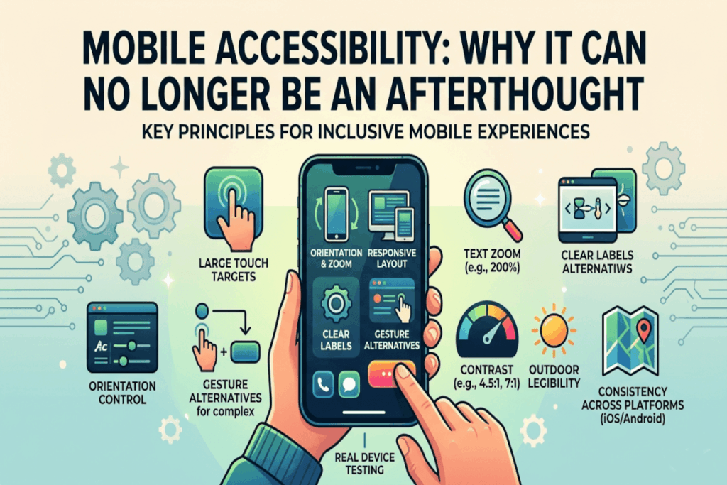
Touch Targets: The Foundation of Usable Mobile Design
One of the most fundamental, and most frequently neglected, principles of mobile accessibility is the size and spacing of interactive elements. Buttons, links, and controls that are too small or too close together create genuine barriers for a wide range of users, including those with motor impairments, hand tremors, limited dexterity, larger fingers, or anyone navigating one-handed while multitasking.
This is not a fringe concern. According to the World Health Organization, over 1.3 billion people worldwide live with some form of disability. Many more experience situational impairments, holding a bag, wearing gloves, or managing an injury, that temporarily affect how they interact with a touchscreen. Designing touch targets that are sufficiently large and well-spaced is not an accommodation for the few. It is a quality-of-life improvement for the many.
Orientation and Zoom: Respecting How Users Navigate
Interfaces that lock orientation or break when a user increases text size are telling a segment of their audience that their preferences and needs are inconvenient. That is a costly message to send.
Many users rely on larger text, increased zoom, or landscape orientation to engage comfortably and accurately with digital content. Whether driven by visual impairment, cognitive preferences, or simply the context of use, these adjustments are legitimate accessibility behaviors. Interfaces must be built to support them gracefully. Layouts that collapse, overlap, or become non-functional when text scales are not robust products. They are unfinished ones.
Clear Labels: Removing Ambiguity from Compact Interfaces
The trend toward icon-only interfaces may look sleek, but it introduces ambiguity that erodes usability. Icons are not universally understood. What seems intuitive to one user may be opaque to another, particularly across different cultural contexts, cognitive profiles, or levels of digital familiarity.
On compact mobile interfaces, where context clues are limited and screen real estate is at a premium, labeling controls clearly is essential. Every interactive element should communicate its purpose without requiring the user to guess or experiment. Accessibility and clarity are not competing values here. They are the same value.
Gesture Alternatives: Designing for the Full Spectrum of Interaction
Swipe, pinch, drag, and multi-finger gestures have become common conventions in mobile design. But common does not mean universal. For users with motor disabilities, limited hand mobility, or assistive technology that interprets touch differently, complex gestures can represent significant barriers rather than intuitive shortcuts.
Thoughtful mobile design anticipates this and provides simpler, alternative pathways to accomplish the same actions. A swipe-to-delete interaction, for example, should always have a button-based equivalent. The goal is to never make a gesture the only route to a critical function.
Contrast and Outdoor Legibility: Designing for the Real World
Mobile devices do not live in controlled environments. They are used outdoors in bright sunlight, in dimly lit rooms, on public transit, and everywhere in between. Strong contrast ratios and readable typography are not just best practices for accessibility standards. They are practical necessities for real-world usability.
On smaller screens, the stakes for poor contrast are even higher. Text that is borderline readable on a large desktop monitor can become entirely illegible on a phone in natural light. Building with generous contrast from the start ensures the product performs where users actually are, not just where designers preview it.
Consistency Across Platforms: Building Trust Through Predictability
Users who switch between iOS and Android, or who use the same product across multiple devices, expect a degree of predictable behavior. Accessibility conventions are baked into both major mobile platforms for good reason. They reflect years of research and refinement around how people interact with touch interfaces.
Organizations should follow platform accessibility conventions as a baseline, then layer their brand identity on top. Reinventing interaction patterns in the name of uniqueness often comes at the cost of usability and trust. Predictability is a feature, not a limitation.
Real Device Testing: Where Assumptions Meet Reality
Emulators and simulators have an important place in the development workflow, but they cannot replicate the full texture of real-world mobile use. Touch accuracy, screen glare, physical motion, and the behavior of native accessibility settings like VoiceOver or TalkBack all present differently on an actual device in a real person’s hands.
Testing on real devices, with accessibility settings enabled, is the step that separates teams who believe their product is accessible from teams who know it is. The gap between those two positions matters enormously to the users on the receiving end.
Accessibility as a Mobile Quality Standard
Mobile accessibility improves the experience for everyone because mobile contexts are inherently variable and unpredictable. The features designed to help users with disabilities, larger text, better contrast, clearer labels, alternative gestures, also benefit users in challenging environments, users who are tired, distracted, or pressed for time, and users who simply prefer a more forgiving interface.
This is the core insight that shifts accessibility from a compliance obligation to a strategic priority. Accessible mobile design is not a narrower product. It is a better one.
Start today: audit your most critical mobile user journeys on real devices with accessibility settings fully enabled. The gaps you find are not edge cases. They are opportunities.