Summary
This is an article in a series of articles on digital accessibility posted on Global Accessibility Awareness Day (GAAD) 2026. Want to celebrate and participate? Share this article with others in your digital world.
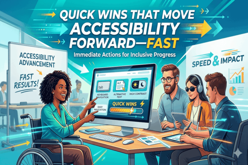
Accessibility progress does not always hinge on a full redesign or a six-figure budget. In practice, some of the highest-impact improvements are small, targeted changes that remove common barriers immediately.
If your goal is momentum, not perfection, start with the fundamentals. These quick wins deliver measurable gains in usability, inclusion, and overall product quality.
Start With Alt Text That Actually Communicates
Alternative text is not a compliance artifact, it is a user experience layer.
When images lack meaningful alt text, screen reader users lose context. The solution is not to describe every pixel, it is to communicate intent.
What this looks like in practice:
- An ecommerce product image should describe the item and key differentiators, not just say “image.”
- A chart in a report should summarize the insight, for example, “Sales increased 25 percent year over year.”
If the image adds value, the alt text should deliver that same value in words.
Structure Content the Way Users Navigate It
Headings are more than visual styling, they are the backbone of navigation for assistive technologies.
A well-structured page allows users to scan, skip, and orient themselves efficiently.
In the real world:
- A news article with properly nested headings allows a screen reader user to jump directly to sections like “Key Takeaways” or “Analysis.”
- A poorly structured page forces users to read linearly, increasing friction and time on task.
Use a single primary heading, then build a logical hierarchy without skipping levels.
Fix Color Contrast Where It Matters Most
Low contrast is one of the most pervasive, and most avoidable, accessibility failures.
It impacts users with low vision, color blindness, and even those in bright environments on mobile devices.
A common scenario:
- Light gray text on a white background may look modern, but becomes unreadable outdoors or for users with reduced contrast sensitivity.
Prioritize contrast for body text, buttons, and links, especially at smaller font sizes.
Replace “Click Here” With Meaning
Links should communicate destination, not rely on surrounding context.
Generic phrases like “click here” break navigation for users who browse by links alone.
Better approach:
- Instead of “click here,” use “Download the accessibility checklist” or “View pricing plans.”
This small shift dramatically improves clarity and efficiency.
Make Keyboard Access Non-Negotiable
Not every user interacts with a mouse. Keyboard navigation is essential for many users with motor disabilities, as well as power users.
Test it yourself:
- Use the Tab key to navigate your site.
- If you cannot reach a button, menu, or form field, that barrier is real for your users.
Every interactive element should be operable via keyboard alone.
Keep Focus Visible and Predictable
Keyboard users rely on focus indicators to understand where they are on the page.
Removing or obscuring focus styles creates disorientation.
A frequent mistake:
- Designers remove focus outlines for aesthetic reasons without providing an alternative.
Instead, ensure focus states are clearly visible, consistent, and aligned with your design system.
Label Forms Like You Mean It
Forms are often where accessibility issues translate directly into lost conversions.
Without proper labels, assistive technologies cannot reliably convey what each field requires.
Real-world impact:
- A checkout form without labeled inputs increases abandonment, especially for screen reader users.
Every input needs a clear, programmatically associated label. Placeholder text alone is not enough.
Turn Errors Into Guidance
Error handling is a critical usability moment.
Vague or hard-to-find error messages leave users stuck.
What effective looks like:
- “Password must be at least 8 characters” is actionable.
- “Invalid input” is not.
Make error messages specific, visible, and easy to resolve.
Stop Surprising Users With Auto-Play
Unexpected audio or motion disrupts focus and can create real barriers, particularly for users with cognitive or vestibular sensitivities.
A better pattern:
- Let users choose when to play media.
- Provide clear controls for pausing or stopping content.
Respect user control at all times.
Write for Clarity, Not Complexity
Plain language is not about simplifying ideas, it is about making them accessible.
Clear, concise writing reduces cognitive load and improves comprehension across the board.
Consider this:
- A benefits explanation written in dense, technical language excludes users who need straightforward information.
- The same content, written clearly, improves outcomes for everyone.
Accessibility Momentum Starts Small
These changes are not theoretical, they are practical, testable, and immediately impactful. They improve experiences not just for users with disabilities, but for anyone interacting with your product.
Call to Action
Build a simple 10-point checklist from these quick wins. Apply it to your highest-traffic pages first. Measure the impact. Then scale.
Accessibility maturity is not achieved in a single initiative, it is built through consistent, intentional improvements like these.